


How Welcoming Is Your Website? Website Layout Tips to Increase Engagement With Your Visitors

Your website is your 24/7 salesperson. It doesn’t call in sick, take vacations or waste time at the water cooler.
But it also can’t connect with a prospect the way a real salesperson can.
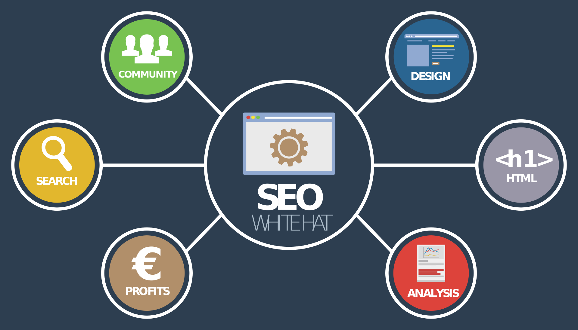
Google processes more than 40,000 searches per second. Your website layout must engage visitors before they choose a different search result.
Your website design should have a conversion in mind. At all points, it should move prospects along the path from browsing to buying or contacting you.
Many visitors to your site won’t be buyers – yet. They’re still doing their research and comparisons between brands. (So make sure you know what your competitors are doing.)
If your website looks professional, it boosts the perception your business is professional.
Wondering what kind of website layout will increase engagement? Read on for our best tips!
Start with the Wireframe
Use a solid wireframe to break up the design into its parts. Make sure they fit together in a logical way.
Keep your website layout as simple as possible. A visitor should be able to understand your offer within five seconds.
And only use a single layout for all pages. A consistent design helps visitors to work out where they are and where they should go.
Do you include video in your website? 52 percent of marketers cite video as the content that generates the best ROI.
It’s a great way to connect with visitors. A simple (and short) welcome video can engage those looking for the human touch.
Navigation
Make it obvious where visitors can find information. Put your navigation bar at the top of the page so users don’t have to scroll to find it.
And don’t use cute terms for your pages. ‘About’, ‘Contact’ or ‘Blog’ might sound obvious. But that makes it easier for visitors to know what each link goes to.
That applies to social media icons too. Use the symbols people recognize from each platform. Don’t make them guess what buttons do.
Signpost where they should go next so they don’t get confused and leave. Keeping visitors on your site longer helps cut your bounce rate. That improves your search engine optimization (SEO).
Calls to Action
Aim for ‘approachable’ in your layout by guiding the visitor through your website. Beyond the home page, stick to asking visitors to take one action on each page.
Offering a choice might seem the better way. You’ll capture more leads that way, right?
Wrong.
More options make it less obvious what the visitor should do next. It also introduces the paradox of choice. When a person has too many options, they often choose to walk away instead.
Consider what colors you use for your calls to action. Many people tinker with the color of their CTA button.
People with color blindness/deficiency won’t register red and green in the way you intend. Colors like blue or even black are ‘safer’ choices.
Make the CTA button stand out so a visitor knows where to click.
Use a Responsive Website Layout
In 2018, 52.2 percent of website browsing happened on mobile phones. Having a mobile responsive site is crucial to an online presence.
Does your website work on mobile? By that, does it alter its layout to suit the device?
If so, great. You’re serving up a website that matches the device a visitor uses. If not, you need a responsive website. There are two reasons for this.
1) Google rolled out its mobile-first index in 2018. Non-responsive websites don’t get priority in search results. That affects your website SEO.
2) A non-responsive website offers a poor user experience. Having to zoom and scroll around a website on a smartphone screen is awful. It’ll prompt most visitors to go back to Google and try again.
Introduce Website Segmentation
It’s important to make sure each page on your website asks for one action. As we’ve said, too many calls to action can confuse your visitor.
But what do you do if your business offers several services? Not every visitor will want or need them all.
This tip goes back to ‘navigation’ above. Segment your site in the navigation bar so visitors can find what they’re interested in.
We’ve used that approach in our navigation bar so you can find the articles you need.
Or create a ‘choose your own adventure’ style home page. Let’s pretend your company offers website design, SEO services, and content marketing.
You might add three graphics for each service leading to separate areas. Use a heading like ‘How can we help you today?’ for this section.
Both options make it clear where visitors need to go next.
Create Good Forms
Contact forms are a bonus because they save users from firing up their email client. Nor do they have to copy and paste your email address into a web-based email provider.
It’s more convenient and removes a barrier that might put them off contacting you.
But what about your lead magnet or opt-in forms?
The conventional wisdom is to keep forms short. Entering a first name and email address is easier than filling out eight forms just to get a download.
That said, the more forms you add, the more you screen potential leads. Only the ones who really want to contact you will fill in all the fields. This gives you fewer leads, but the leads you do get are better qualified
Use A/B Testing
Don’t rush out and try all these tips at once. You won’t know which ones are having the greatest impact.
Instead, test one change at a time. Try a new button color and wait for a few weeks.
Check your analytics. Did conversions go up or down? If they go down, reverse the change. If they go up, keep the change and then test something else.
This methodical approach means you always know what impact changes have on conversions. Double-down on what works and discard what doesn’t.
You should notice that an uptick in conversions matches an improvement in your SEO.
Nail Your Website Layout
Does your website get little traffic but high conversions? Congratulations! Your website is fine so you just need more traffic!
But if your website gets lots of traffic but no (or few) conversions? Then you have a problem and fixing your website layout could solve it.
Follow these tips (using the process listed under A/B testing). Always measure the impact of what you’re doing for the most success.
And if you need more traffic to take better measurements? Check out our articles on SEO strategies that can get you started.